


Flags are arguably the best way to grab attention to your shop or brand, catching the eye and drawing interest. A pretty flag isn’t enough though, it’s got to be bold, readable, and send a clear message to your audience. To help you do that, we’ve provided our 3 top tips on how to make your flag stand out from the crowd.

1.Colours and contrast
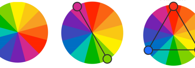
The best flags have bold, complimentary or triadic colours which draw the eye.
- Bold colours are visually stimulating and can grab attention from a distance.
- Complimentary colours are opposite each other on the colour wheel.
- Triadic colours are equally spaced around the colour wheel.

L-R
Colour wheel
Complimentary colours
Triadic colours
Images courtesy of Macrovector
Make sure your flag is accessible by using contrasting text and background colours. Help the reader focus by choosing colours that enable them to focus on the message, not the background. Some colours are harder to work with than others, bright pink can draw too much attention, distracting the reader from the message. Black is a perfect background for light or pale colours. White is ideal for colours with a darker value.
The five most legible colour combinations for a retail sign or flag are:
- Black on Yellow
- Black on White
- Yellow on Black
- White on Blue
- Green on White
Need help picking colours? Coolors have a range of handy tools including a colour palette generator and contrast checker to help make colour choices easier.
2. Font
When choosing which type of font for your flag, consider the message you need to send while keeping consistent to your brand.
Sans-serif is a category of font which doesn’t use ‘serif’s’ (the short flourishes on characters or letters) Serif is generally considered, quicker and easier to read. Serif fonts include Times Roman, Courier, New Century Schoolbook, and Palatino. Popular sans-serif fonts include Helvetica, Avant-Garde, Arial, and Geneva.

Traditionally serif fonts are used in printed media, such as newspapers. Serif is also more commonly used in corporate texts or where serious information needs to be communicated, such as medical journals. Because of this, serif is often more trusted than sans serif.
Sans-serif was created for use in computers. According to some studies, it is quicker to read, but not always preferred. However, sans-serif is widely considered more modern, so may be more appropriate for your message.
Whichever type of font you choose, keep these key points in mind:
- Choose a bold, simple typeface. One that can easily be seen from a glance, especially if your flag needs to be read from a distance or whilst waving in the wind.
- Avoid using more than two fonts. If you need two fonts, pick ones that compliment each other to make your message stand out. Fontpair.co can help you find complimentary fonts.
- Use fonts that are legible from a distance. Avoid fonts with elegant, thin strokes. These are harder to read and can get lost on a waving flag.
3. Text
When it comes to text on flags, less is definitely more. Design professionals for billboards generally recommend no more than seven words.

Try to mix upper and lowercase letters. It’s considered easier to read than words made entirely of capitals, and keep your language simple. Viewers may only have a few seconds to read your message, so increase readability by not overusing capital letters or long words.
Create a visual hierarchy with different text sizes. The largest font will always grab attention first. Most western countries generally read from left to right, top to bottom. With that in mind, make sure your message follows this. The most important message at the top in the biggest font, and subsequent messages further down. This helps you communicate the importance of the information on your flag.
Following these steps will help you create an eyecatching, accessible flag sure to get your message across. But, a great flag is nothing without a great location. So consider carefully where your flag is going before you start designing it. If it’s going against a dark building, a lighter flag might be more appropriate. If it’s going to be in a busy car park, or trade show (have you seen our blog, 5 ways to boost engagement with clever event signage?), make sure you have a tall flagpole to elevate your message above the crowds.
Whatever your flag or branding needs, Borney Branding are here to help.


